BLogo: Difference between revisions
No edit summary |
|||
| Line 46: | Line 46: | ||
* [[CLogo]] | * [[CLogo]] | ||
* [[Trochus/Hoop]] | * [[Trochus/Hoop]] | ||
==References== | |||
{{reflist}} | |||
== External links == | == External links == | ||
Revision as of 13:56, 7 December 2015
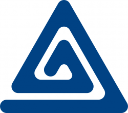
The BLogo is a graphic symbol for boylove that is widely used across the online boylove community. It consists of two blue intertwined triangles, one outer that symbolizes the man, and one inner that symbolizes the boy in a boylove relationship. Due to its shape, it is occasionally described as a "spirangle".
Symbology
The triangle theme originated with the inverted pink triangle that known homosexuals were forced to wear in Nazi concentration camps during Germany's Third Reich period. Gay communities have adopted the upside down pink triangle as a symbol of gay pride. The BLogo designers took that symbology a step further, inverting the triangle and changing the color to blue. The BLogo is designed to be an easily recognizable and reproducible logo for boylovers, while also being anonymous when the situation demands it. A large consideration in the design process was to make a symbol that could be easily drawn in the sand with a finger.
History
The BLogo was designed in February 1997 by Kalos in response to a online design contest sponsored by Tygyr, a teenage boylover whose Tygyrnet website was very popular at the time. Various triangle designs had been proposed but none became popular with the BL communities of the day. When Kalos submitted his design, it struck an instant chord and was adapted very quickly by Free Spirits and by many other on-line boylover organizations.
There is an interesting personal story behind the design: Kalos did not actually do the artwork for the BLogo. He facilitated the design with his life partner of more than 20 years. Kalos and his partner the artist have been together since Kalos' partner was just 14 years old.
My partner and I hit on the double triangles + blue colour as the basis for the design.
The symbolism has been discussed before and seems self-evident. If it isn't, refer to the graphic explanation above.
Since our design philosophy predicates that the ideal visual symbol should be capable of being drawn in the sand with a finger, a continuous line imposed itself as the solution.
We also took into account it's reproductability both in colour and black & white. Also, it should be possible to make it into a three-dimensional object, a lapel pin for instance.
We also wanted to create an image that was not too "in your face" so as to permit the user to acknowledge it's true meaning or... be as non-commital as the situation demands.
The BLogo's use is restricted to BL positive use only. Modifications and variations will be tolerated (indeed, are encouraged!) as long as the BL positive message is respected.
Any other use is strictly prohibited and will be dealt with severely under International Copyright and Communications Laws.
Blogo © 1997 Kalos
Vintage documents
An original working sketch for the design of the BLogo was published in L'Élu, a french online magazine[1].
Artistic representations
-
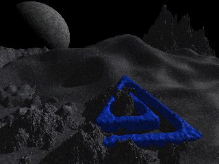
blue by Dragonist
-
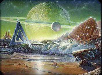
BL Planet by Boynimation!
-
BL Planet by DaveBOYLOVER
-
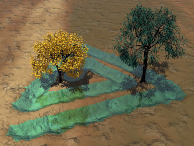
Blue water by Jadeite
See also
References
- ↑ 'L'Elu' magazine, Vol.I, nr.1, 2008, p.7.
